JSF panelGrid example
The panelGrid
JSF panelGrid is mostly used for JSF components positioning in what may be called as a table layout. We usually define the number of columns that will make the table layout and add components to it as children of the layout itself:
<h:panelGrid columns="2" cellpadding="0" cellspacing="2">
  <h:outputText value="First name:" />
  <h:outputText value="#{userBean.firstName}" />
  <h:outputText value="Last name:" />
  <h:outputText value="#{userBean.lastName}" />
  <h:outputText value="Age:" />
  <h:outputText value="#{userBean.age}" />
</h:panelGrid>
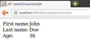
Since we defined the layout as having 2 columns JSF will render an HTML table with 2 columns. The child elements will be placed alternatively in each column. Each time we reach the number of defined columns while going through the child elements JSF will create a new row.
The resulting HTML will be the following:
<table cellpadding="0" cellspacing="2">
  <tbody>
    <tr>
      <td>First name:</td>
      <td>John</td>
    </tr>
    <tr>
      <td>Last name:</td>
      <td>Doe</td>
    </tr>
    <tr>
      <td>Age:</td>
      <td>36</td>
    </tr>
  </tbody>
</table>
And the corresponding visual output:

Component wrapping
We may also group multiple components in wrapper so they are displayed inside a single table cell. One way to do this is by wrapping some components inside a panelGroup:
<h:panelGrid columns="2" cellpadding="0" cellspacing="2">
  <h:outputText value="First name:" />
  <h:outputText value="#{userBean.firstName}" />
  <h:outputText value="Last name:" />
  <h:outputText value="#{userBean.lastName}" />
  <h:outputText value="Age:" />
  <h:outputText value="#{userBean.age}" />
  <h:outputText value="Address:" />
  <h:panelGroup layout="block">
    <h:outputText value="#{userBean.streetAddress}" /><br />
    <h:outputText value="#{userBean.zipCode}" /><br />
    <h:outputText value="#{userBean.state}" /><br />
  </h:panelGroup>
</h:panelGrid>
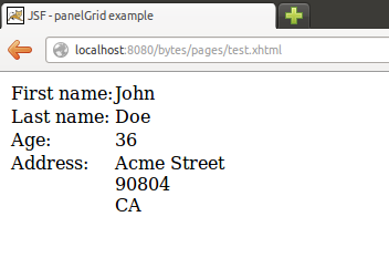
Now the streetAddress, zipCode and state outputText components will be all wrapped inside a panelGroup and consequently positioned inside the same table cell.

Facets
We may also define facets for the panelGrid. Let's define facets for both the header and footer of the panelGrid:
<h:panelGrid columns="2" cellpadding="0" cellspacing="2">

  <f:facet name="header">
    <h:outputText value="User Details" />
  </f:facet>

  <h:outputText value="First name:" />
  <h:outputText value="#{userBean.firstName}" />
  <h:outputText value="Last name:" />
  <h:outputText value="#{userBean.lastName}" />
  <h:outputText value="Age:" />
  <h:outputText value="#{userBean.age}" />
  <h:outputText value="Address:" />
  <h:panelGroup layout="block">
    <h:outputText value="#{userBean.streetAddress}" />
    <br />
    <h:outputText value="#{userBean.zipCode}" />
    <br />
    <h:outputText value="#{userBean.state}" />
    <br />
  </h:panelGroup>

  <f:facet name="footer">
    <h:panelGroup id="footer" layout="block">
      <h:panelGroup id="lastLogin" layout="block">
        <h:outputText value="Last login: " />
        <h:outputText value="#{userBean.lastLogin}" />
      </h:panelGroup>
      <h:panelGroup id="logout" layout="block">
        <h:commandButton value="Logout" action="#{userSessionBean.logout}">
        </h:commandButton>
      </h:panelGroup>
    </h:panelGroup>
  </f:facet>

</h:panelGrid>
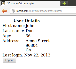
We have defined two facets: header and footer. The header facet contains an outputText with an example title for our panelGrid. The footer facet is composed by multiple nested components.
This is done intentionally in this example in order to illustrate how you may nest any components you need inside a panelGrid facet (actually this is valid for any facet contained in any JSF component that supports facets).
The result is the following:
